An art show can be an odd event to see me at. I like clothes, fashion, jewellery, prints for my home and pretty things. But the actual art side can get a bit lost on me. So sometimes I feel like I might as well be at a conference on aerodynamics that is all in Old English. But, I'm also big into new designers and always want to help the next big thing get their first step, so I popped along to the Glasgow School of Art Graduate Show this week to see what new design talent I could spot. Or see if I could get any prints for the empty hooks in my flat.
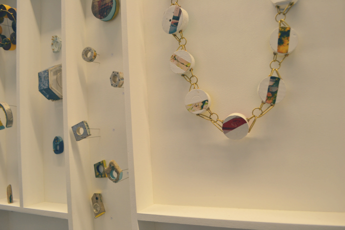
The jewellery and silversmith offering this year was very strong and I struggled to narrow down my favourites. You might have spotted that I like whimsical and sometimes childlike jewellery so I went with Sinead Toner as my first pick whose designs made use of white and pastel pink. Her piping detail however was the clinch for me as it reminded me of the iced gems sweets from my childhood. Very very veerrrrryyyyy close second however was Amy Dunnachie (pictured) who's range also had a reminiscent feel to it and was inspired by her coastal upbringing. She makes great use of unusual materials that you'd find at the seaside such as rope, nails and - one of my favourite jewellery materials - wood. Just look at those statement rings!
Also honorary mentions to jewellery designer Sophie Warringham and silversmith designer Victoria Woods-McMeekin who's designs also caught my eye.
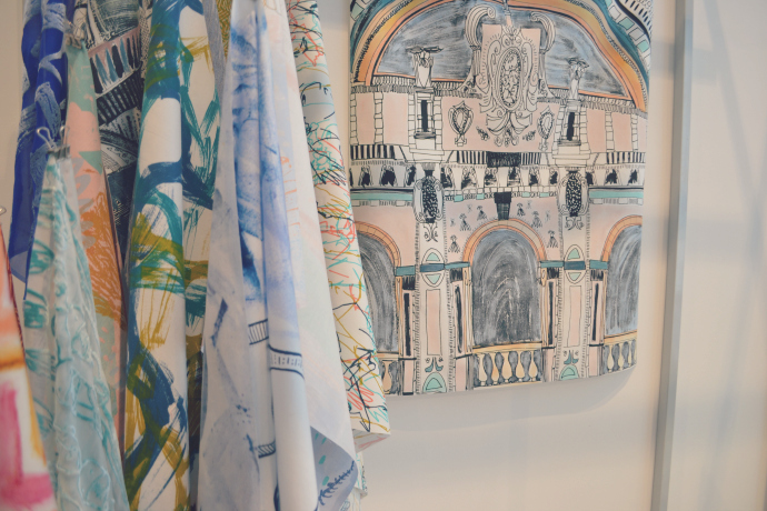
Onto textiles and it was two designers that caught my eye who I have decided to give joint favourites to. Pictured is Ruth Crothers who's illustrations of buildings printed onto clothing makes it stand out but the use of pale colours allow the pieces to still be quite wearable. Joint favourite was Natasha Samasuwo who also creates bold eye-catching prints with use of paler shades to balance the effect.
From the fashion section my heart was stolen by Jane Maguir who had hanging in her stall a sheer dress adorned with flowers to cover just the correct places. It's struck me as some kind of provocative wedding dress and whilst I wouldn't wear it myself there was something so enchanting about it.
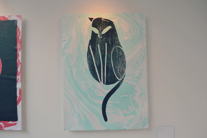
Onto Communication Design which was probably the most arty of the lot and I, erm, truthfully probably had a confused look on my face at most of it However two pieces caught my eye which when I returned home realised they were by the same designer: Andrew Northcote. The cat print above is honestly something I would buy to place on my own living room wall and whilst I don't play chess his abstract take on the game is something that would encourage me to maybe sit down for a game.
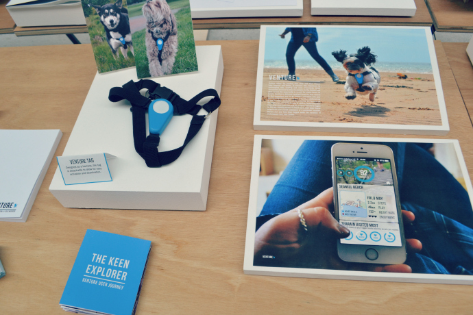
Finally, I moved into Product Design which is not actually a form of design I was at all familiar with beforehand by my god was I blown about by some of the innovative ideas (some of which I would love to see come to fruition). Each student had to create three products and whilst there was some unbelievable displays two student's who work was consistently catching my eye was Hannah Steele and Amber Jones (who's Twitter says she quoted Sex and the City in her dissertation - my kind of person!). Hannah brought to the table a necklace which contains pheromones (as my favourite pheromone infused but probably not CF perfume is almost out I'm in the market ha!) whilst Amber's stand out piece for me was a yoghurt which works with the body as natural UVA protection.
Have a look at the other Product Design offerings in the Flickr group. The Product Design students also by far had the best marketing collateral for me to flick through (I'm a marketer and it made me happy to see well designed business cards, ha!).
Did you swing by the Glasgow School of Art this week or stop by any of the other degree shows this summer?

Onto textiles and it was two designers that caught my eye who I have decided to give joint favourites to. Pictured is Ruth Crothers who's illustrations of buildings printed onto clothing makes it stand out but the use of pale colours allow the pieces to still be quite wearable. Joint favourite was Natasha Samasuwo who also creates bold eye-catching prints with use of paler shades to balance the effect.
From the fashion section my heart was stolen by Jane Maguir who had hanging in her stall a sheer dress adorned with flowers to cover just the correct places. It's struck me as some kind of provocative wedding dress and whilst I wouldn't wear it myself there was something so enchanting about it.

Onto Communication Design which was probably the most arty of the lot and I, erm, truthfully probably had a confused look on my face at most of it However two pieces caught my eye which when I returned home realised they were by the same designer: Andrew Northcote. The cat print above is honestly something I would buy to place on my own living room wall and whilst I don't play chess his abstract take on the game is something that would encourage me to maybe sit down for a game.

Finally, I moved into Product Design which is not actually a form of design I was at all familiar with beforehand by my god was I blown about by some of the innovative ideas (some of which I would love to see come to fruition). Each student had to create three products and whilst there was some unbelievable displays two student's who work was consistently catching my eye was Hannah Steele and Amber Jones (who's Twitter says she quoted Sex and the City in her dissertation - my kind of person!). Hannah brought to the table a necklace which contains pheromones (as my favourite pheromone infused but probably not CF perfume is almost out I'm in the market ha!) whilst Amber's stand out piece for me was a yoghurt which works with the body as natural UVA protection.
Have a look at the other Product Design offerings in the Flickr group. The Product Design students also by far had the best marketing collateral for me to flick through (I'm a marketer and it made me happy to see well designed business cards, ha!).
Did you swing by the Glasgow School of Art this week or stop by any of the other degree shows this summer?

